Saturday, 17 May 2014

Evaluation Statement

Review Of Final Major Project (FMP)

Jessica Parry                                                                                Media Production.

The Notion Of Chance.


For my final outcome I made an animation based on my experience in the London Bombings. I feel it was a successful piece of work as although it is based on a tragic event I wanted it to be portrayed in a contrasting way and I feel I have achieved this. My original Project Proposal was very much based on the butterfly effect, the notion of chance and the notion of choice however I decided to look into my own experience more and look at death and the fears surrounding that.

I have updated my blog 3-4 times weekly and written a review at the end of each week, which has really helped with the development of my project. I have stuck to my original FMP Plan and the targets I made have been a good structure for the Final Major Project. I used my sketchbook for notes and useful research I found, along with storyboards, character design and interviews creating a journey I have been on throughout the seven weeks.

The targets I have reached from my original FMP Plan are 1. To complete my research, 2. Develop and experiment with ideas, 3. Complete the animation. Whilst completing my FMP I added a few more targets to help me reach my goals, these included: Experiment with different animation techniques and carry out tests and experiments when making the final animation to ensure it is fluid. These targets were very helpful and adding to them as I went along helped me to notice things that I had missed.

Developments I have made along the way include developing the idea from a tragic event to a childs innocent view of the world. I also created many different endings as I wanted to see which one worked best. I developed my characters design to no facial features as I didn’t want their expression to determine the viewers emotion of the story. I also developed some of the scenes to make them look more sinister by creating masks on after effects and following the character across the scene. I experimented with the colour in the animation, I tried no colour, full colour and rougly coloured in, with colours that you wouldn’t expect. 

I received a lot of helpful advice from other sources throughout my project including galleries, films and books in order to achieve my final animation and the best ending I should use. I found the weekly group crits and group reviews we had very useful as I gathered feedback on what I had completed that week and advice on what I should look at next. I also enjoyed looking at other peoples projects and giving them my advice and feedback, and watching their projects progress.


A few key points I will take away include improving my time management, so I had longer to create the animation and had time to do reshots and add extra scenes if I needed to. I would also draw more frames per scene so my animation looked more fluid. I have developed many skills including life drawing, rotoscoping, using istopmotion and the planning of the overall project. Next year I am going on to do a degree in Animation so all these skills I have learnt throughout this project will be very useful. I will continue to further my knowledge on istopmotion and continue to work on my drawing skills by attending more life drawing classes.

Friday, 16 May 2014

Review of week 7.

This was the final week of the final major project. At the start of the week I completed scenes 5-9 drew them and photographed them. After this I imported all clips into after effects and put them all together, I added sound on iMovie and added titles and then exported it to audition to master my sound. I got feedback from the teachers which was overall positive however they did advise I cut the animation short after the paper gets ripped as that is more of a natural ending. I have submitted the longer version for the showreel but I will submit the short version for the final submission. I have really enjoyed this final major project and I am very happy with my outcome.

Thursday, 15 May 2014

A Day Out In London - Final Animation

I am really happy with my final animation I think it tells my story but in a completely different way which I was aiming for. Although the animation was from a childs point of view for example all the people have turned into animals, with my dad narrating the story it works well as they contradict each other. Although the narrative is quite simple I think it works well with the simple style design and the minimalist backgrounds and colouring. I am pleased with the drawings I think the movements are fluid and walk cycles and animal movement work well. The sounds are all relevant to the scene with a busy station background noise, animals noises and the narration over the top. If I was to improve my animation I would push the narration further as there are no boundaries in animation, I would also  manage my time slightly better and allow more time to make the animation.

A Day out in London Final Animation

Feedback from tutors

I showed 3 different tutors my final animation and they all said they enjoyed it and thought it was quite emotional. However 2 of them said I should cut the last part of the animation and the end should be after the paper rips in half, they said that would keep it simple and the end part is irrelevant. However one tutor said that the character needs to go through a change which it does in the last part of the animation.
After this feedback I have asked other people and I have decided to take their advice and cut the animation short. I submitted the extended version for the showreel as I had no time to cut it but for my final submission I will submit the shorter animation.

Wednesday, 14 May 2014

Edits

At the beginning of this week I photographed the final scenes using istopmotion. I then imported all scenes into after affects and put them all together, I controlled the lighting on some of the scenes as some of them were a bit flickery, using levels and contrast. For a few of the scenes I used masks over the top of my characters to create a suspicious atmosphere. To do this I created a mask and used the mask path, mask feather and mask expansion to follow the character as it moved across the scene. I then imported my film into iMovie to add sound as my sound files would not open in after effects. I also created a title scene in iMovie. I then imported my film into audition to master my sound, I used a song to compare the sound to and then exported it to the desktop.


I also wasn't to sure on the ending so I created a new ending to decide which one I liked best. The first one was the original, which the girl character grown up and she goes to meet her father, showing that she has lost her innocence but things are still the same. The second ending shows the character walking through london but the animals in the story have changed into people, like the elephant is the man at the back drinking the water. I prefer the first ending and I asked people what they think, I got mixed feedback but the majority also liked the first ending so I have decided to stick with the original.


Saturday, 10 May 2014

Review of week 6.

This week i spent starting to make the animation. I started off drawing up a completed storyboard, and made an animatic. I then drew a few more storyboards with alternate endings, however i decided to stay with my original. I then drew out the main characters in the story and coloured so that they are almost a template for when I make the final animation. After this I started to make the animation, I used a light box and created each character for each separate frame moving them slightly each time. Before I finalised these I did a few tests to check they work and look like a fluid movement. Once I had done this I coloured them and cut them out. I set up my camera and photographed 4 scences which took a long time to move each character for each frame. I feel like I am on track but will need to work fast next week to make sure everything is completed for friday.

Friday, 9 May 2014

Producing the Animation

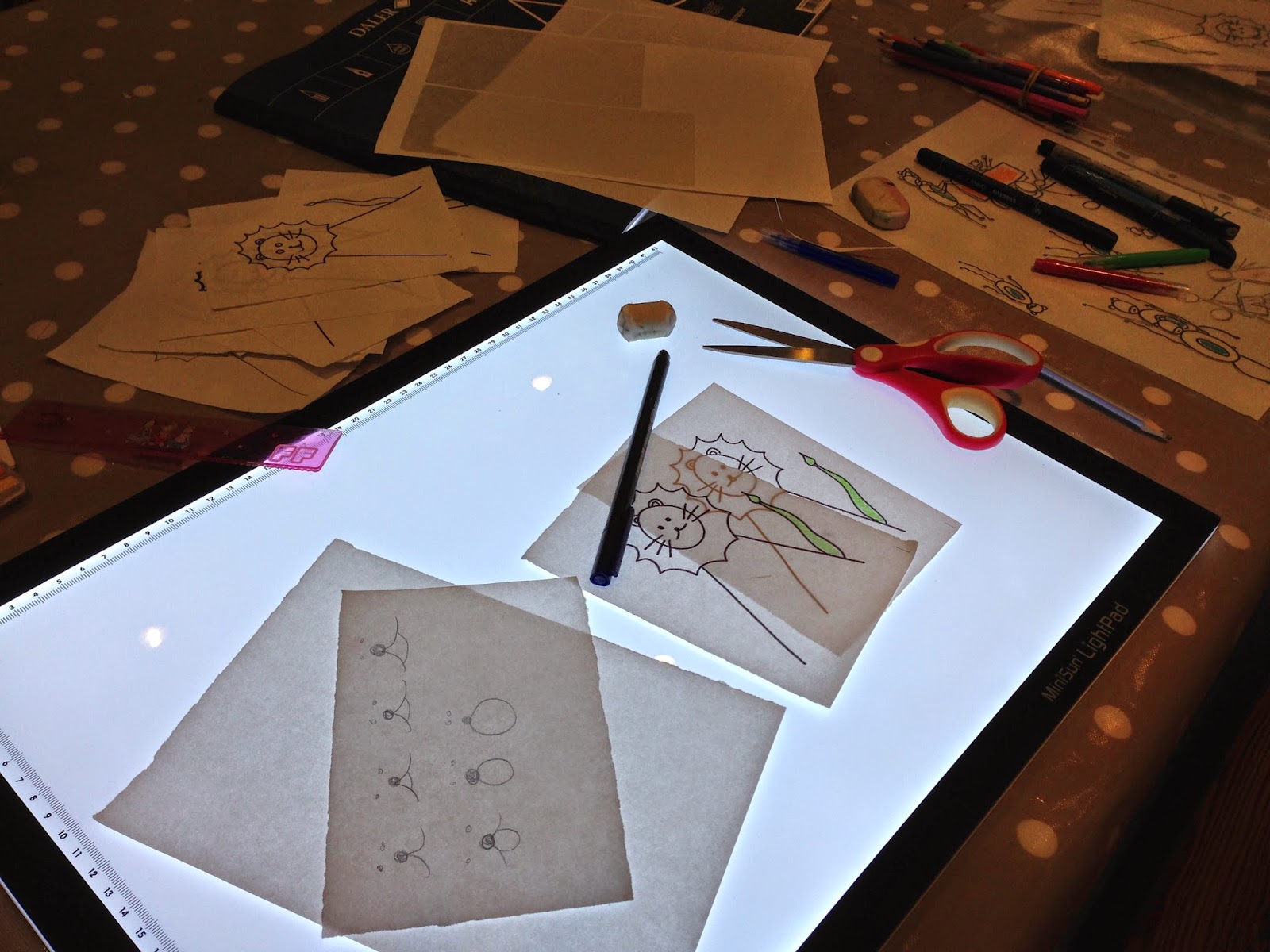
To make the animation I used a light box and make each character move slightly for each frame. Once I had done the drawing I made a test animation on istopmotion to make sure that they all look like they are moving in a fluid movement. If I was happy with that I would them draw round it in blck pen colour them and cut them out. I then drew out the background. I photographed 4 frames which took a long time as I had to move each charceter each time. I have draw out scene 5,6 and 7, and I have yet to draw out scene 8 and 9.


Wednesday, 7 May 2014

Animation Tests

Theses are a few tests I did to make sure my animation flowed well before finalising each drawing. I did this for all my characters. I felt this was a good idea as if i had not done this when it came to shooting the final animation it may not of looked right and i would of had to do it again.


Final Style Design

These are my final character designs that I will use in my animation. Each character has a small area coloured in bright vibrant colours. I really like the design, it is very simple and childlike but i think they work well with the story. I will be drawing my animation so I have a light box, onion skin camera, stand and istopmotion which will help me achieve this. I am going to draw all the frames first then i will photograph each frame at the end so that the lighting doesn't change throughout. I am hoping my animation should last 1-2 minutes depending on how many drawing i complete. I am looking forward to getting on with the animation as I haven't tried this technique before however I know it will take a long time to create a 1-2 minute animation.


Tuesday, 6 May 2014

Life Drawings

I have been attending weekly life drawing classes during the final major project weeks, these are some of the best ones i have produced.


Alternate Endings

After talking with a few tutors I have decided to look at a few alternate endings. The first one just shows the two main characters still in london but the background will form behind them and become fuller, there will be no colour to give the look as if it has drained away.
The second storyboard shows the girl has grown up showing her on the 5th July 2013, she has grown up and realised the world isn't as innocent as she has first thought, shown by the colour has drained away.
The third storyboard will just show a black screen at the last frame. My dad will finish narrating by frame 8 and frame 9 will have myself narrating talking about how it has effected me and how it has changed my views now I'm older.
I do like these alternate endings however I think I will stick with the original as I think that shows the most change and I like the fact the drawing becomes fuller moving away from the simple line drawings.


Monday, 5 May 2014

Animatic


This is my animatic I have made for my final animation. I have made it last 1 minute 50 seconds along with titles, as this is what I hope mine will last for. I have added the narration sound but I think I will add diegetic sound for my final piece, like sound of the animals and background sound of the station.

Final Storyboard

For my final storyboard I have kept all the people as animals however I have changed the final frame, I wanted the character to go through a change so I have decided to make the character grow up. As she grows up she forms eyes and becomes more life like. I will make the background become fuller swell showing that she has grown up and realises what the world is now like, lost her innocence.


Sunday, 4 May 2014

Review of week 5.

This week I have decided i would hand draw my animation so I started off looking at animations on vimeo that use this technique, I also looked at Out of the inkwell a rotoscope animation. I then practiced drawing a monkey swinging along a pole which worked well but i need to work more on the arms to make it look more life like. After this i looked into character design I looked at different cartoon animals on google to decide how i would like my style. I then looked at the children's books miffy by Dick Bruna and Dear zoo by Rod Campbell as their style is very similar to mine. After looking at these I decided I wanted my animation to be in the style of a colouring book with only some objects coloured in roughly, I drew the main characters of my animation and coloured them in this style. Finally this week I had a go of rotoscoping, it worked well and I will hopefully use this for the last frame of my animation.

Friday, 2 May 2014

Time Plan for Final Animation

I have made a quick time plan for the final 2 weeks when i will be producing the animation. The days i have planned work out at 10 extra days to what I actually have. Hopefully I will work fast to overcome this problem and get it finished by the deadline.


Rotoscope

I practiced rotoscope with a giraffe walking. I used a youtube video and drew roughly round the giraffe in each frame. I think the end result has worked well and i hope to use this technique in the last frame of my animation.


Thursday, 1 May 2014

Character Design

These are some of my character design i have completed to try and figure out the style of my animation. I like the detailed drawing but I think practically it will take me too long to draw these for each frame. The simplistic drawings are the style i was originally going for and i think i will stick with them.


Tuesday, 29 April 2014

Out of the Inkwell.

I looked at the short animations Out of the Inkwell by max Fleischer, they were made using rotoscope and uses very simple line drawings and he very rarely uses backgrounds, this is very similar to my design style. It was also helpful to look at an animation that uses rotoscope and I will hopefully use a bit of the technique in my final animation.

Out of the Inkwell Modelling.

Out of the Inkwell a trip to Mars.

Monday, 28 April 2014

Colouring Book

Looking at my style designs I really like the roughly coloured elephant giving the look of a childs colouring book. I think for the beginning and middle of my animation i am going to roughly colour just small random objects. The end of the animation I want it to look like i have realised what the world and people are really like, I have grown up so all the colour will drain away. I think this will work as i was young when this happened so a childs colouring book effect will be relevant.


Dear zoo.

I also found this children's book called dear zoo. The illustration is also very simple but it does use a lot of colour. The style is quite similar to mine in the way that it uses many black lines and does have that much detail in the characters.


Miffy

I looked at Miffy the work of Dick Bruna's, children's book. He uses very simple line drawings to create the characters. The characters are very simple but they are very effective. He uses some colour but only on the clothing and objects. I like his style and i think it is quite similar to mine. Looking at his work has also inspired me to use a bit of colour in my animation, even if it is just a little bit, on certain objects.